Types of Charts
M Chart supports 17 chart types. Downloadable example files are available on the Example Charts page.
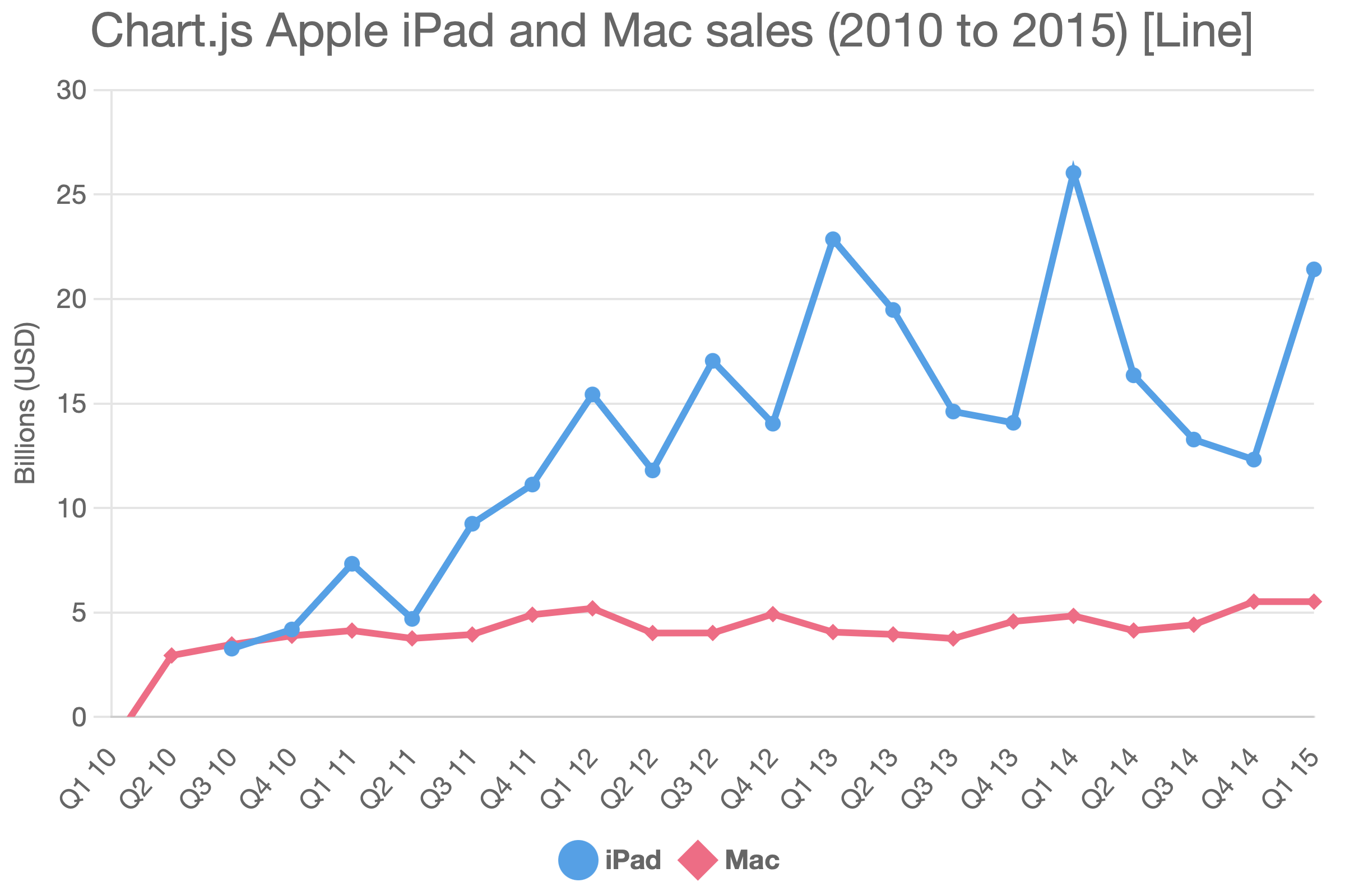
Line
A standard line chart. Best for showing trends over time or continuous data across categories. Supports multiple series.
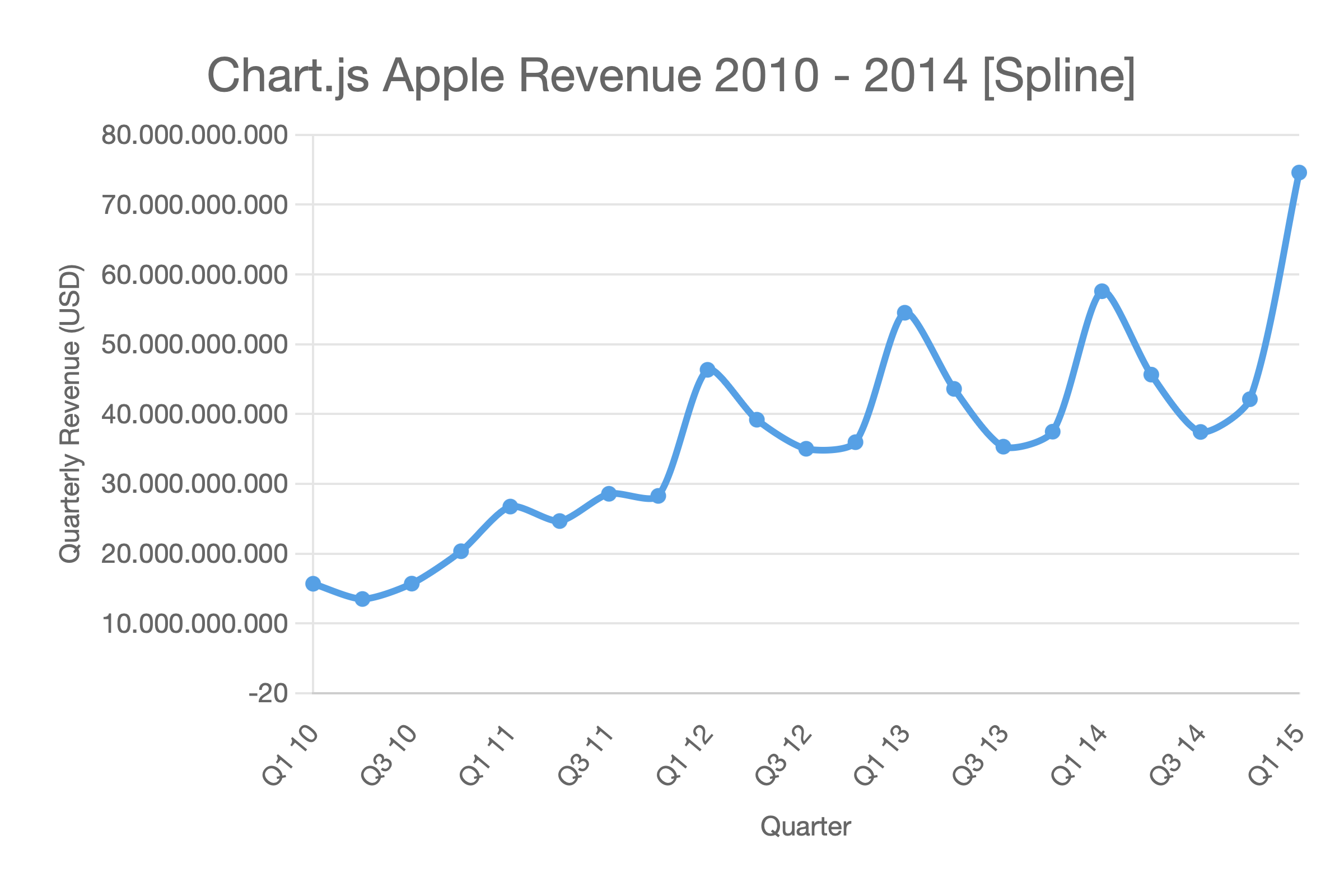
Spline
A smoothed line chart (curved lines between data points). Use when you prefer a visually softer trend line.
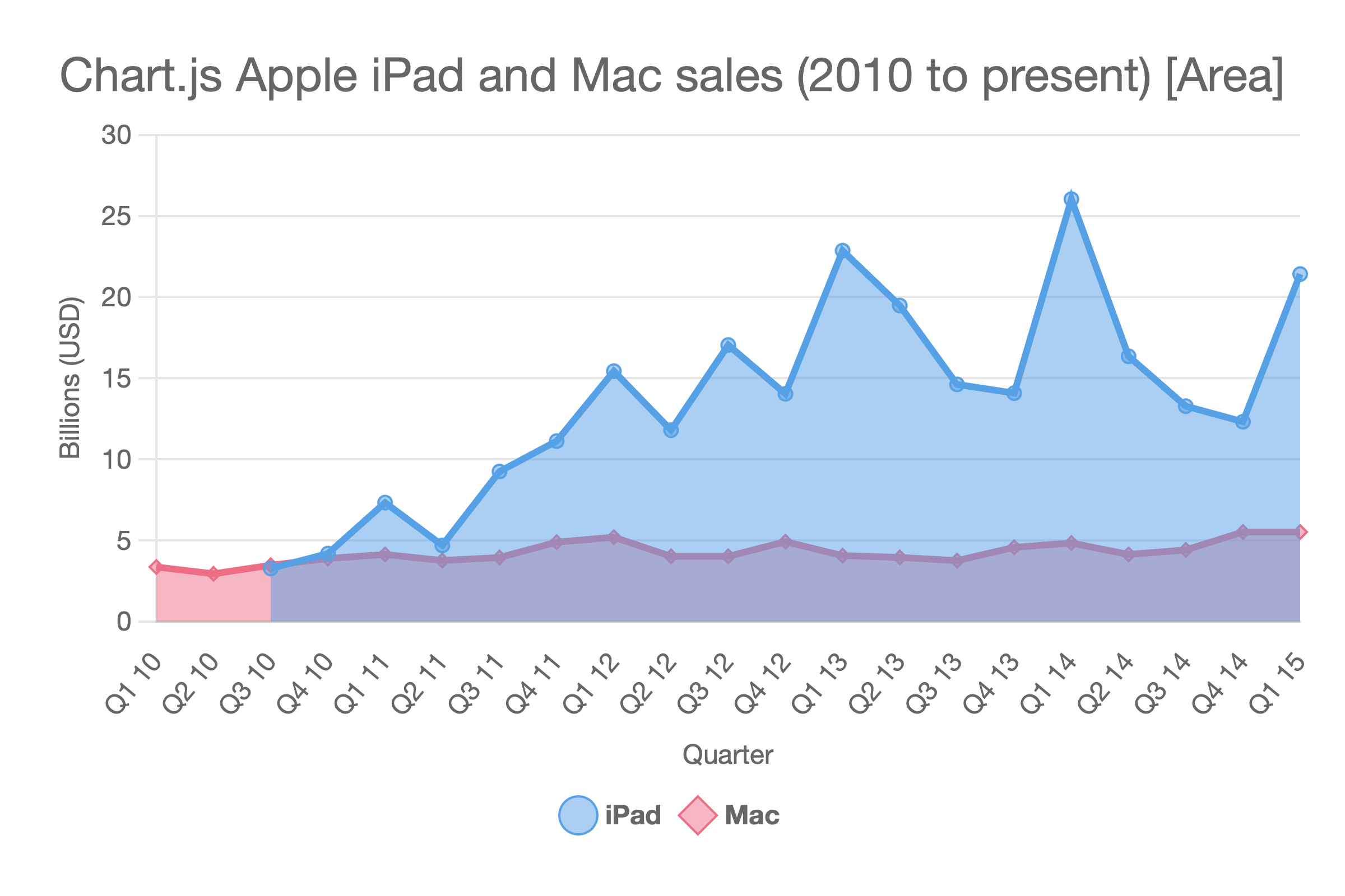
Area
A line chart with the area beneath the line filled. Effective for showing volume or cumulative values.
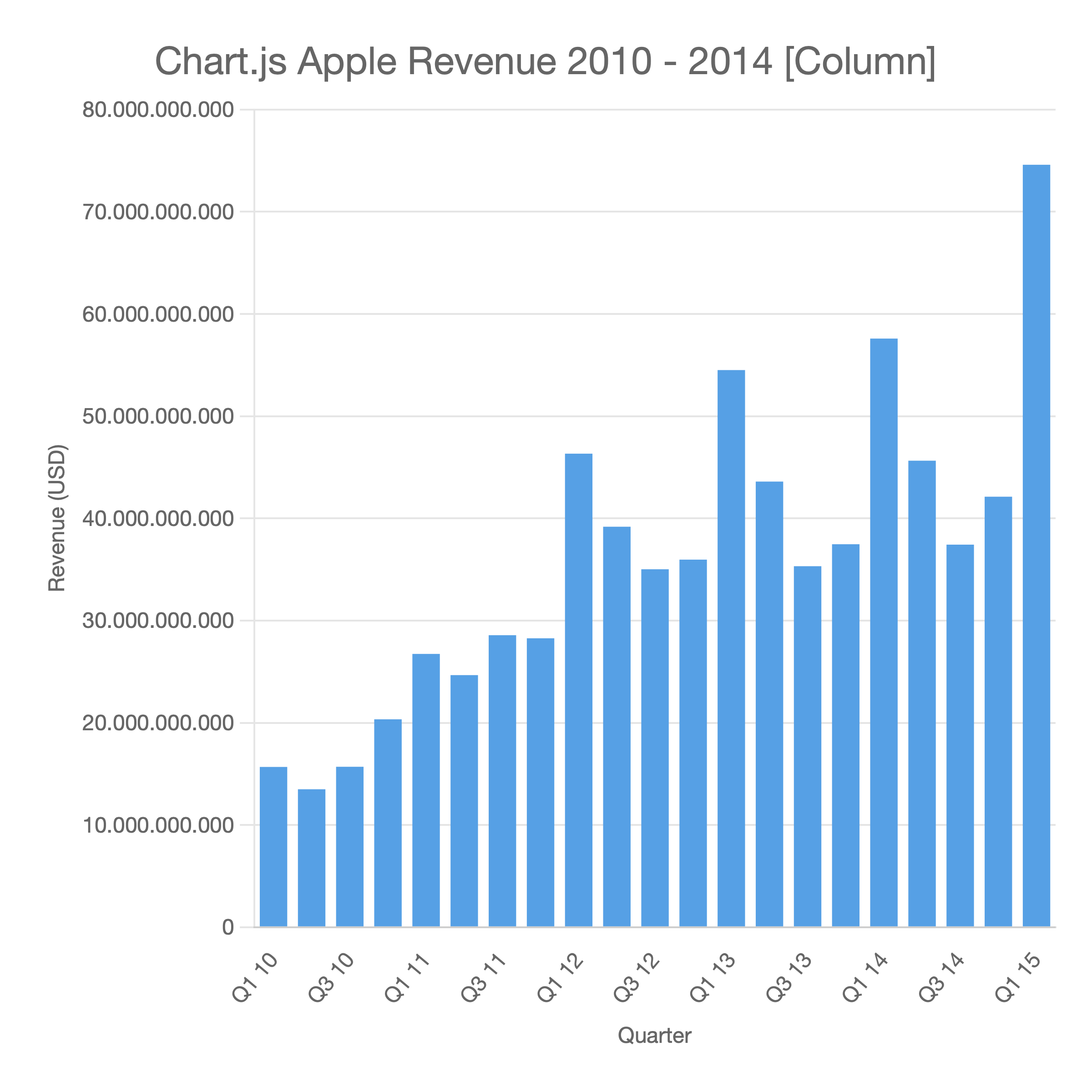
Column
A vertical bar chart. Compares values across categories. Supports multiple series.
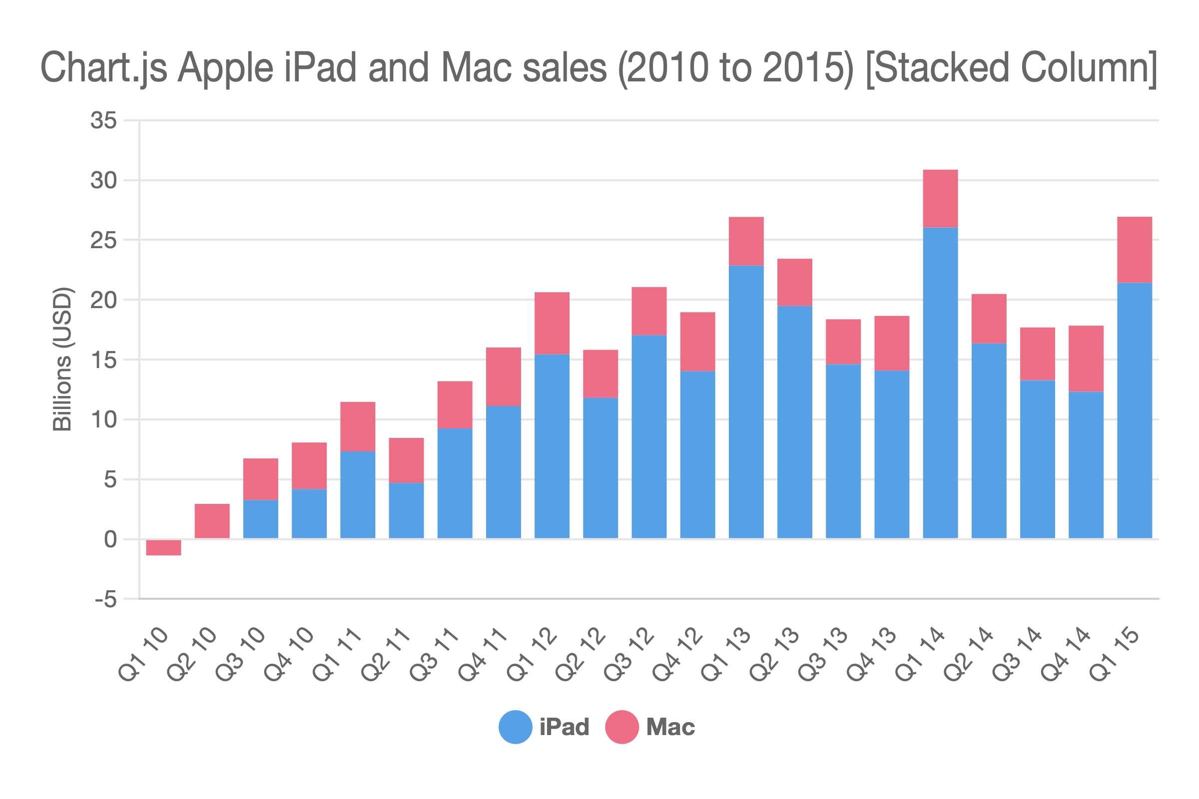
Stacked Column
A vertical bar chart where series are stacked on top of each other rather than grouped side by side. Good for showing part-to-whole relationships.
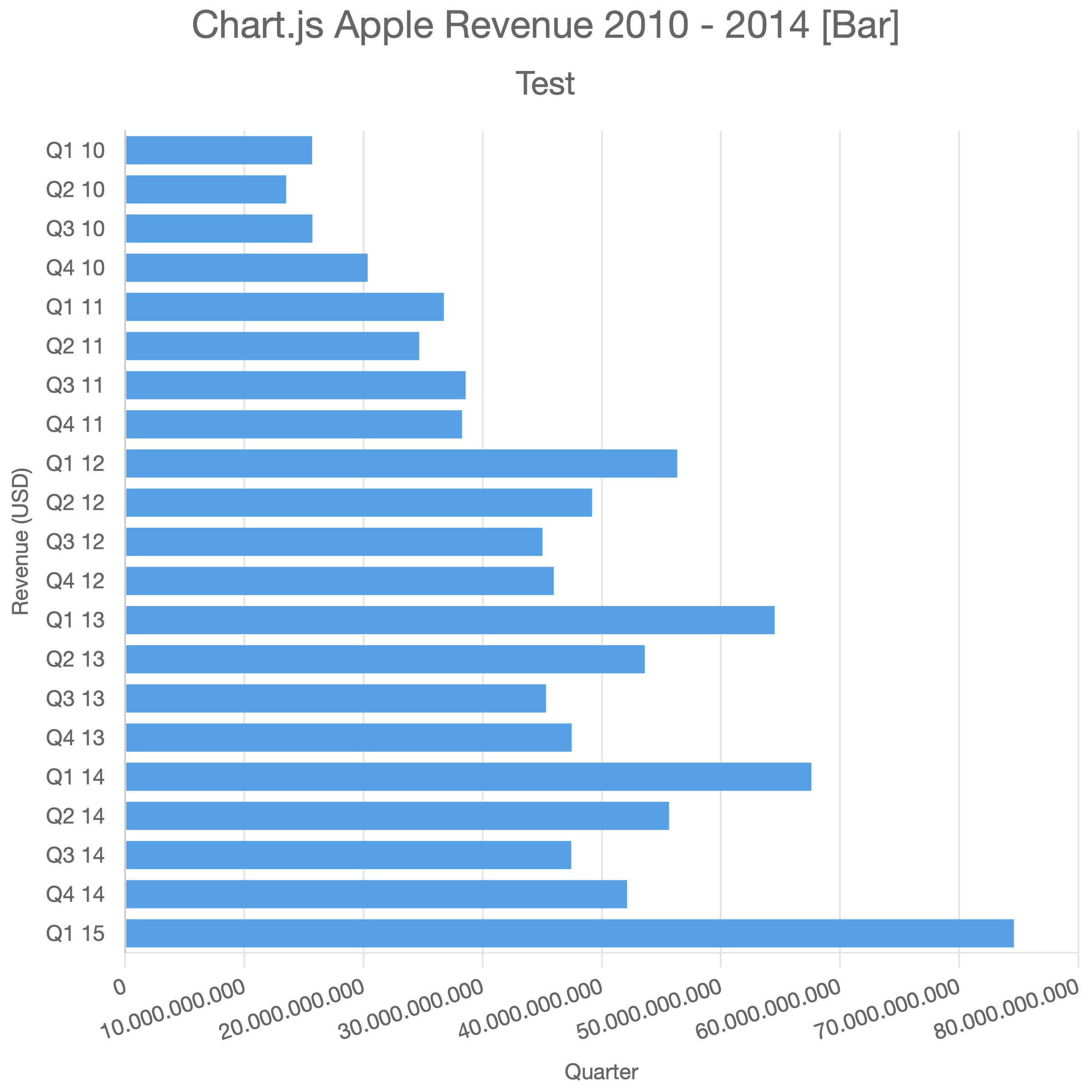
Bar
A horizontal bar chart. Useful when category labels are long or when comparing many items.
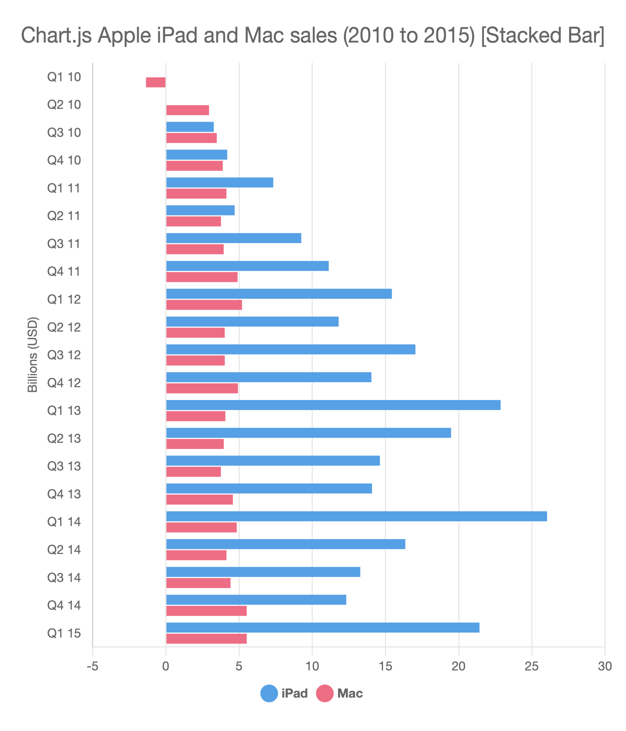
Stacked Bar
A horizontal bar chart with stacked series.
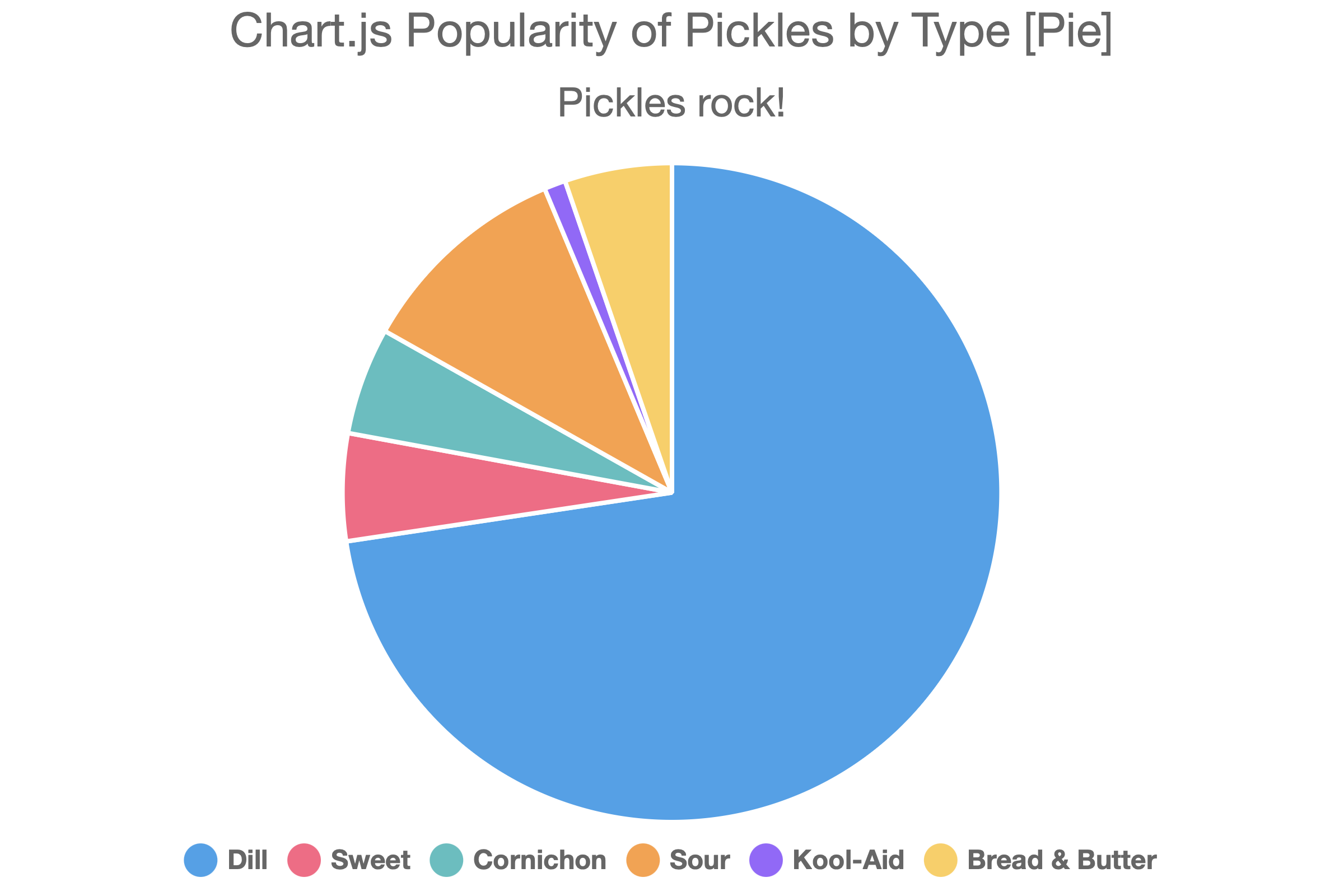
Pie
A circular chart divided into slices, each representing a proportion of the whole. Single-series only.
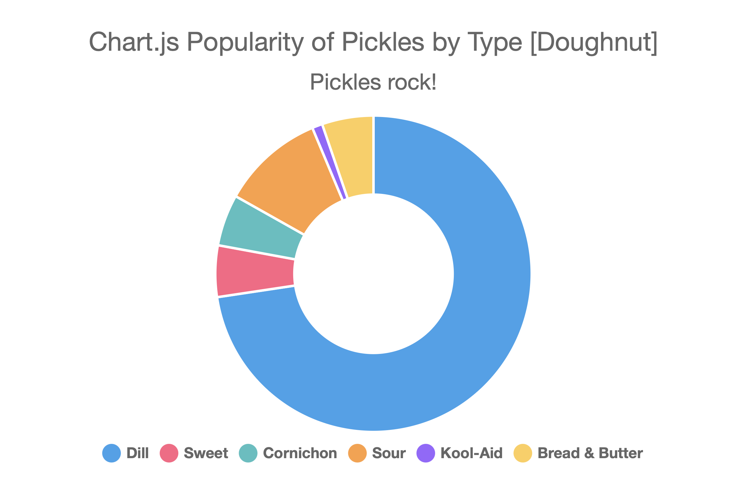
Doughnut
Like a pie chart but with the center hollow. Single-series only.
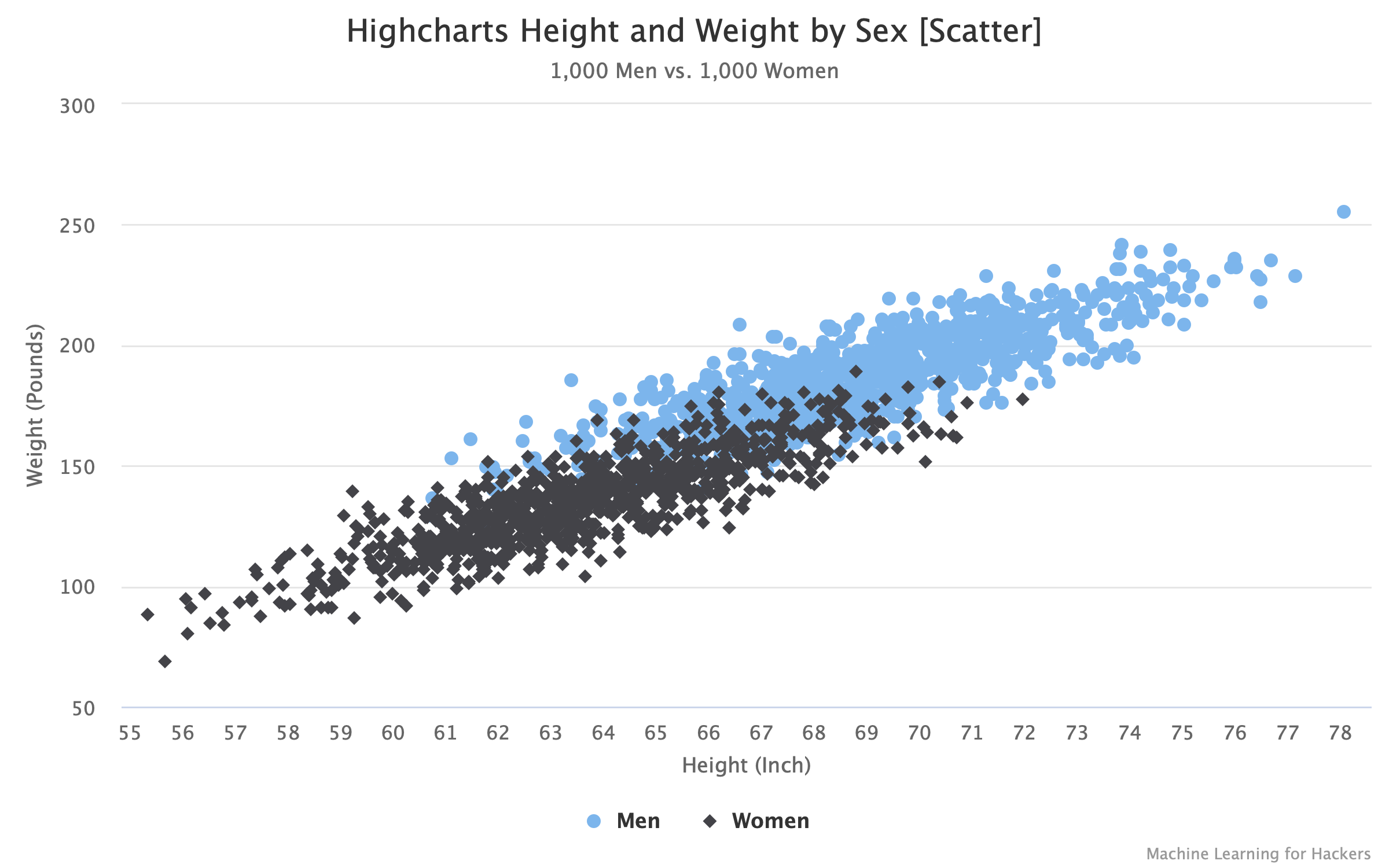
Scatter
Plots data as individual points using x/y coordinates. Requires two columns (or rows) of numeric data per dataset. See Scatter & Bubble Charts for details.
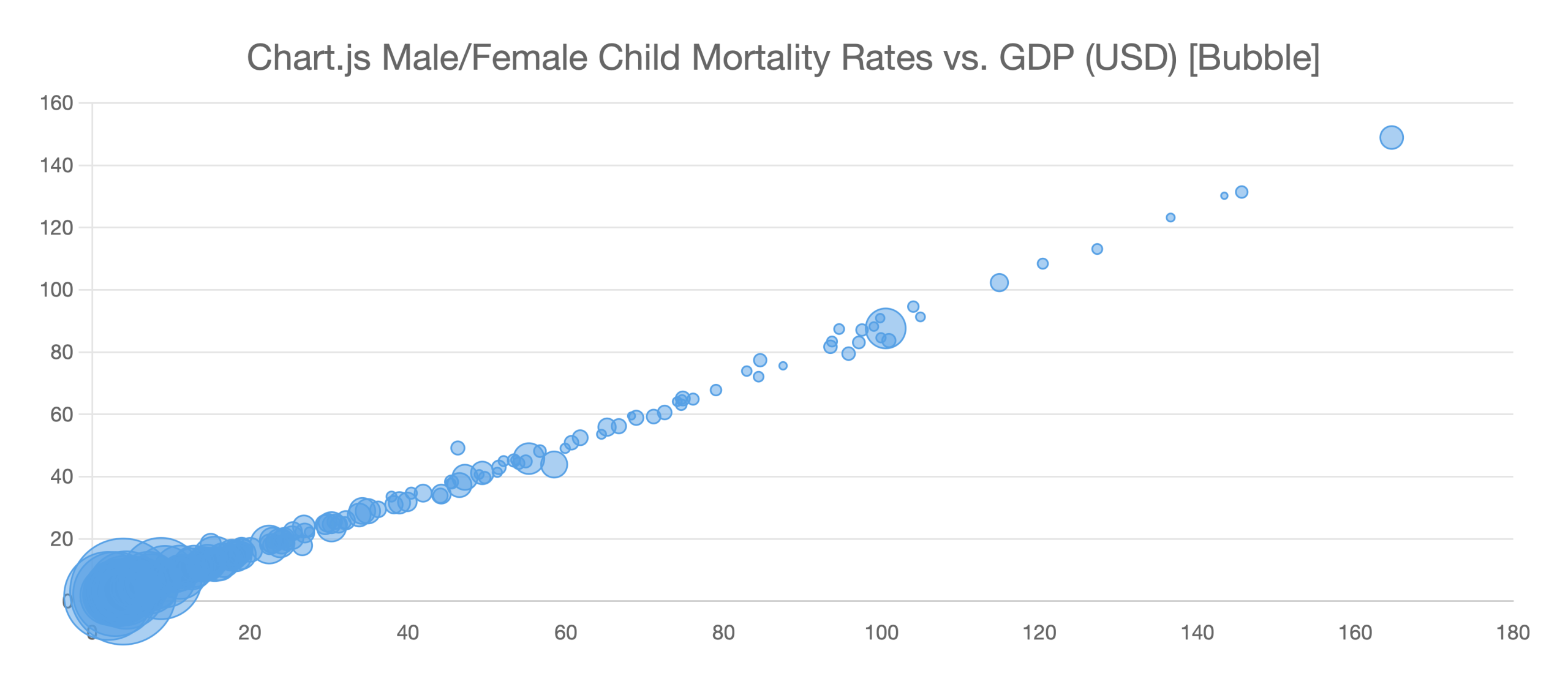
Bubble
Like a scatter chart with an additional size (radius) dimension. Requires three columns (or rows) per dataset. See Scatter & Bubble Charts for details.
Radar
A spider/web chart that plots multiple variables on axes radiating from the center. Useful for comparing profiles across several dimensions. See Radar & Radar Area Charts for details.
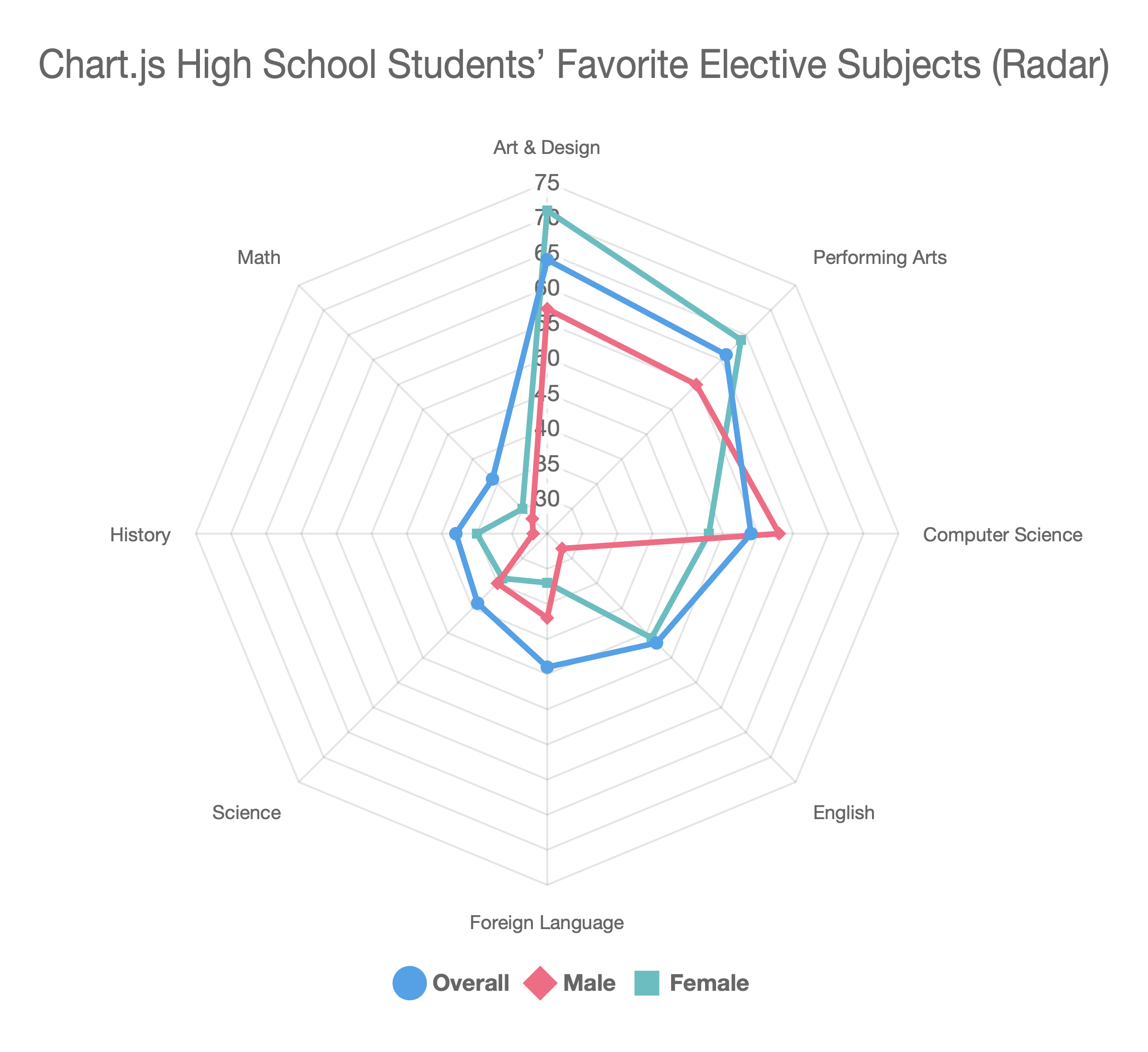
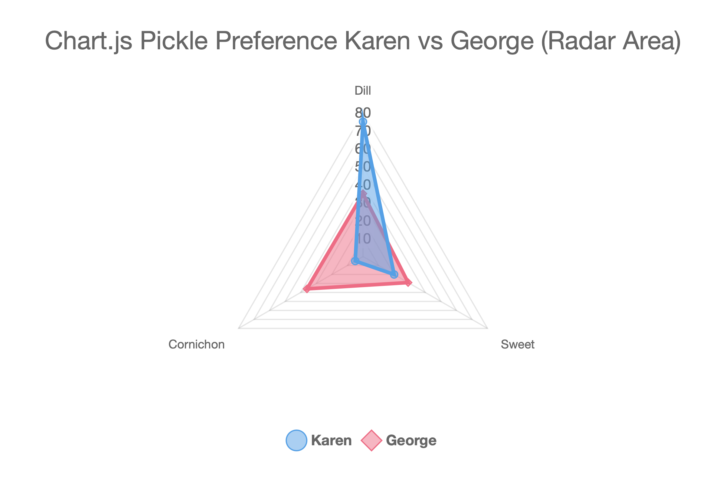
Radar Area
A radar chart with the enclosed area filled.
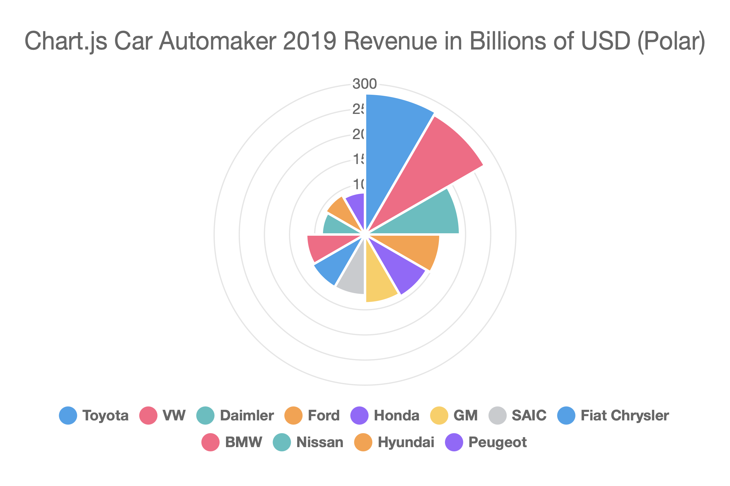
Polar
A circular chart where each segment has equal angular width but variable radius based on its value. Similar to a pie but uses radius rather than arc length to encode magnitude.
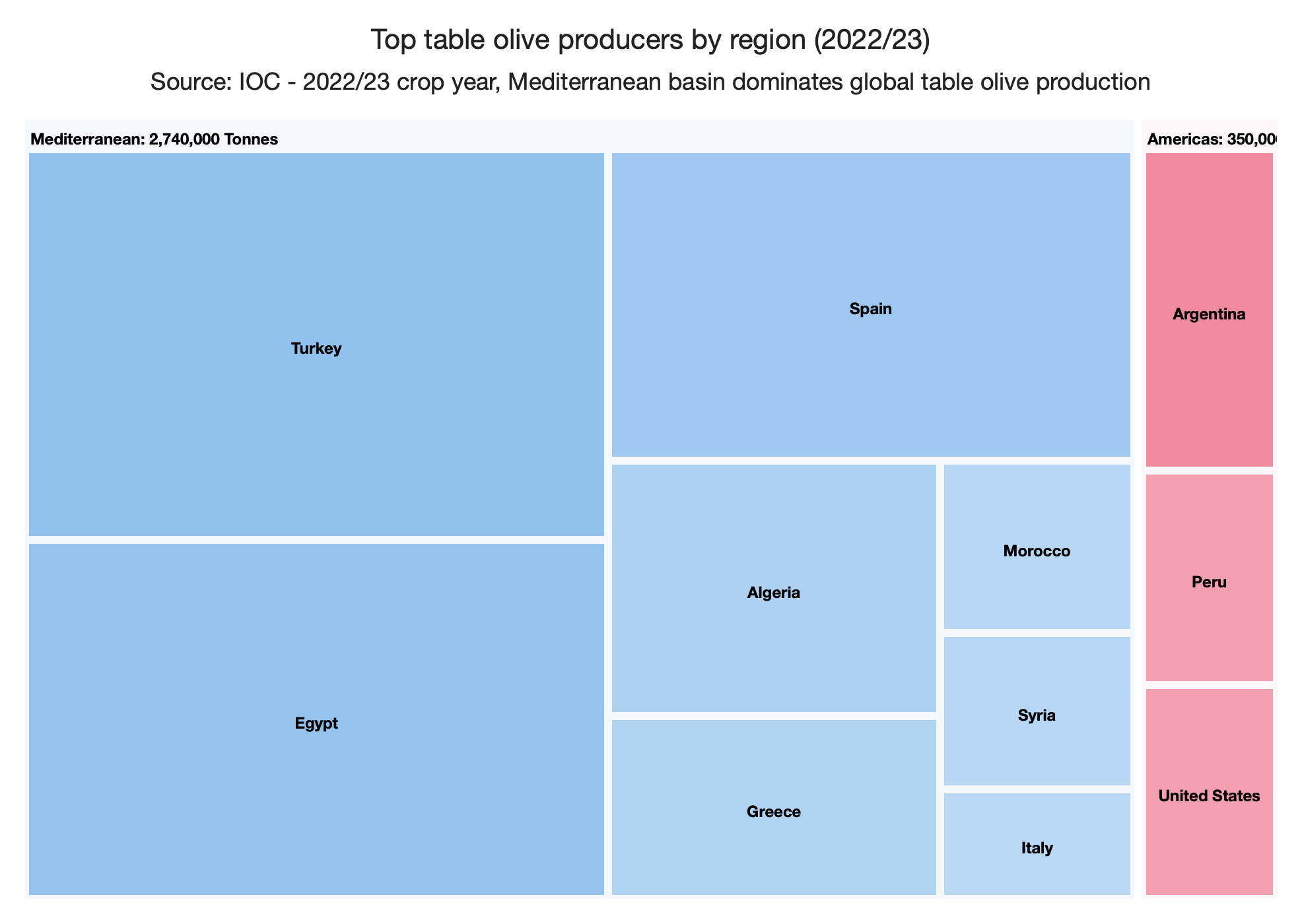
Treemap
Visualizes part-to-whole relationships using nested rectangles whose area is proportional to a value. Supports flat (two-column) and hierarchical (three or more columns) data layouts. Available with the Chart.js library only. See Treemap for details.
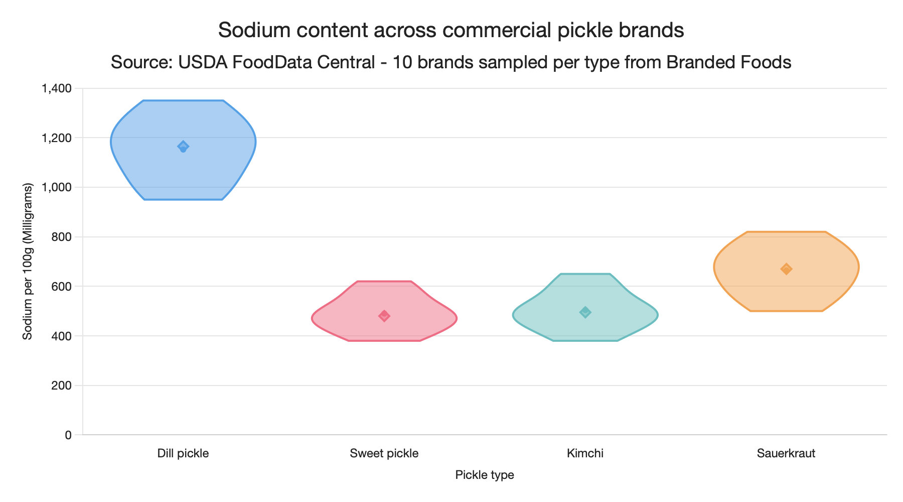
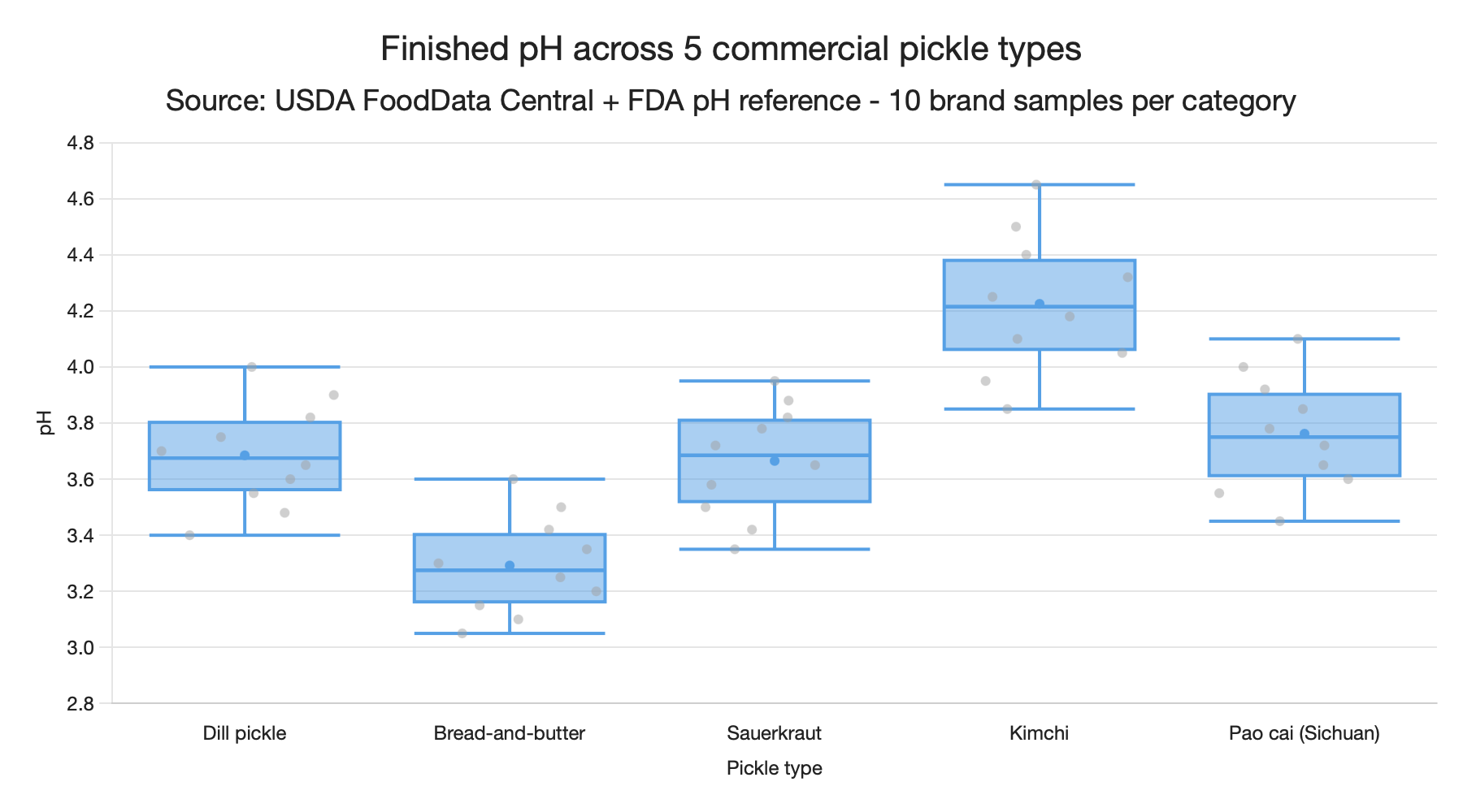
Boxplot
Shows the statistical distribution (minimum, first quartile, median, third quartile, maximum, plus outliers) of values across one or more categories. Available with the Chart.js library only. See Boxplots & Violin Charts for details.
Violin
Like a boxplot, but draws a kernel-density-estimate silhouette so the shape of the distribution is visible. Shares its data format with boxplot. Available with the Chart.js library only. See Boxplots & Violin Charts for details.