Creating a Chart
Charts are created as a custom post type in the WordPress admin. Navigate to M Chart → Add New to create one.
Title/Subtitle
There are Title and Subtitle fields at the top of the edit form. Subtitles are optional and will render below the Title in your Charts with smaller text.
The Spreadsheet Interface
Data is entered in a spreadsheet-style editor. You can type values directly into cells or import a CSV file.
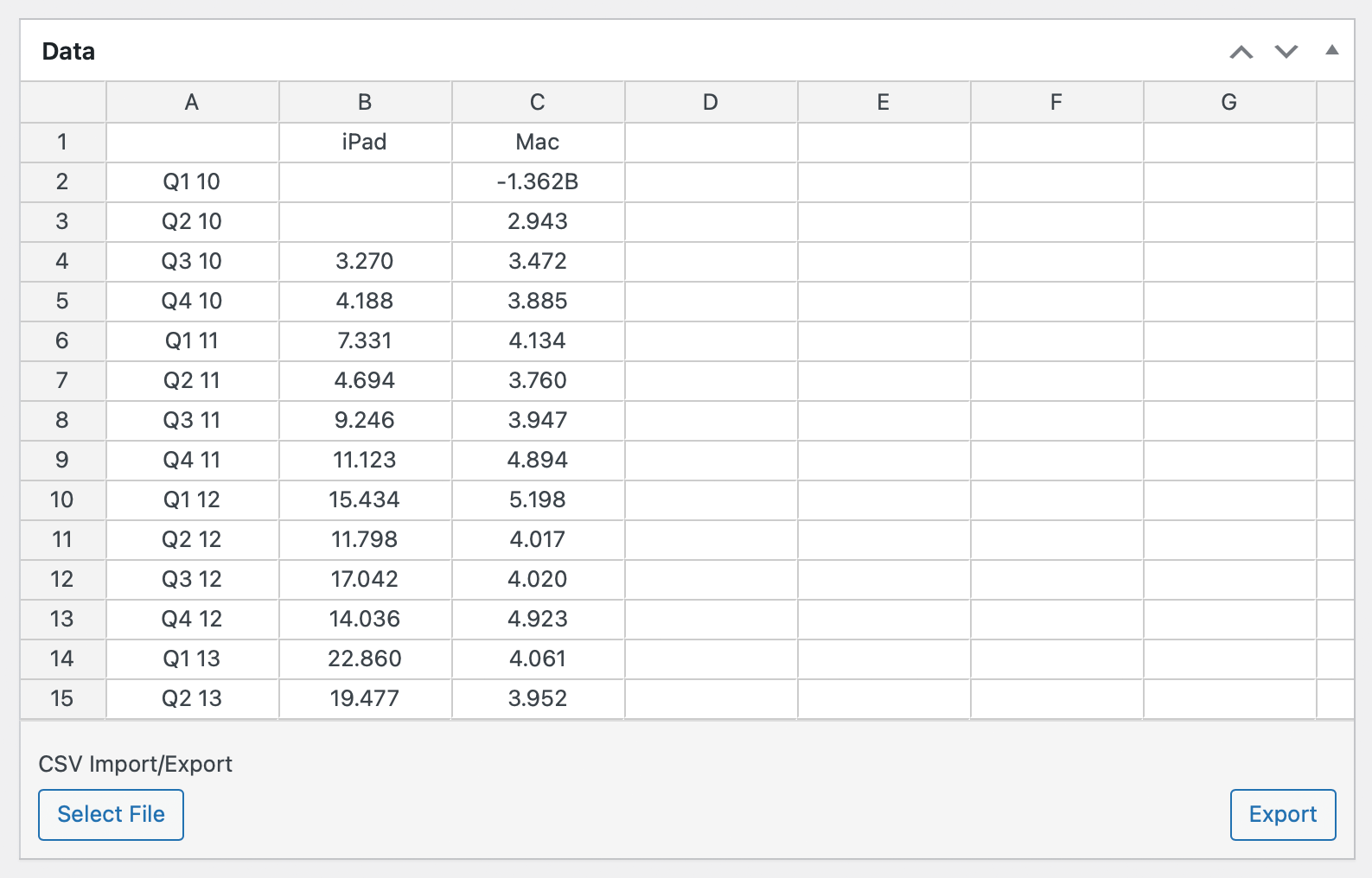
Multi-Series Charts (Line, Spline, Area, Column, Bar)
For charts with multiple data series, organize your data so that:
- The top-left cell is empty
- Column headers (row 1, starting at column 2) are the x-axis labels
- Row headers (column 1, starting at row 2) become the series names shown in the legend
- Data values fill the remaining cells
Example:
| Jan | Feb | Mar | |
| Dogs | 10 | 14 | 12 |
| Cats | 8 | 11 | 15 |
Single-Series Charts (Pie, Doughnut, Polar)
For single-series charts, the top-left cell contains the first label — there is no empty corner cell:
- Column 1 contains the category labels
- Column 2 contains the values
Example:
| Dogs | 42 |
| Cats | 28 |
| Fish | 15 |
Tips
This single-series data format also works for multi-series chart types (line, bar, etc.) when you only have one data series. M Chart detects the format automatically.
Chart Settings
Below the spreadsheet and directly below the live preview you'll find the chart settings.
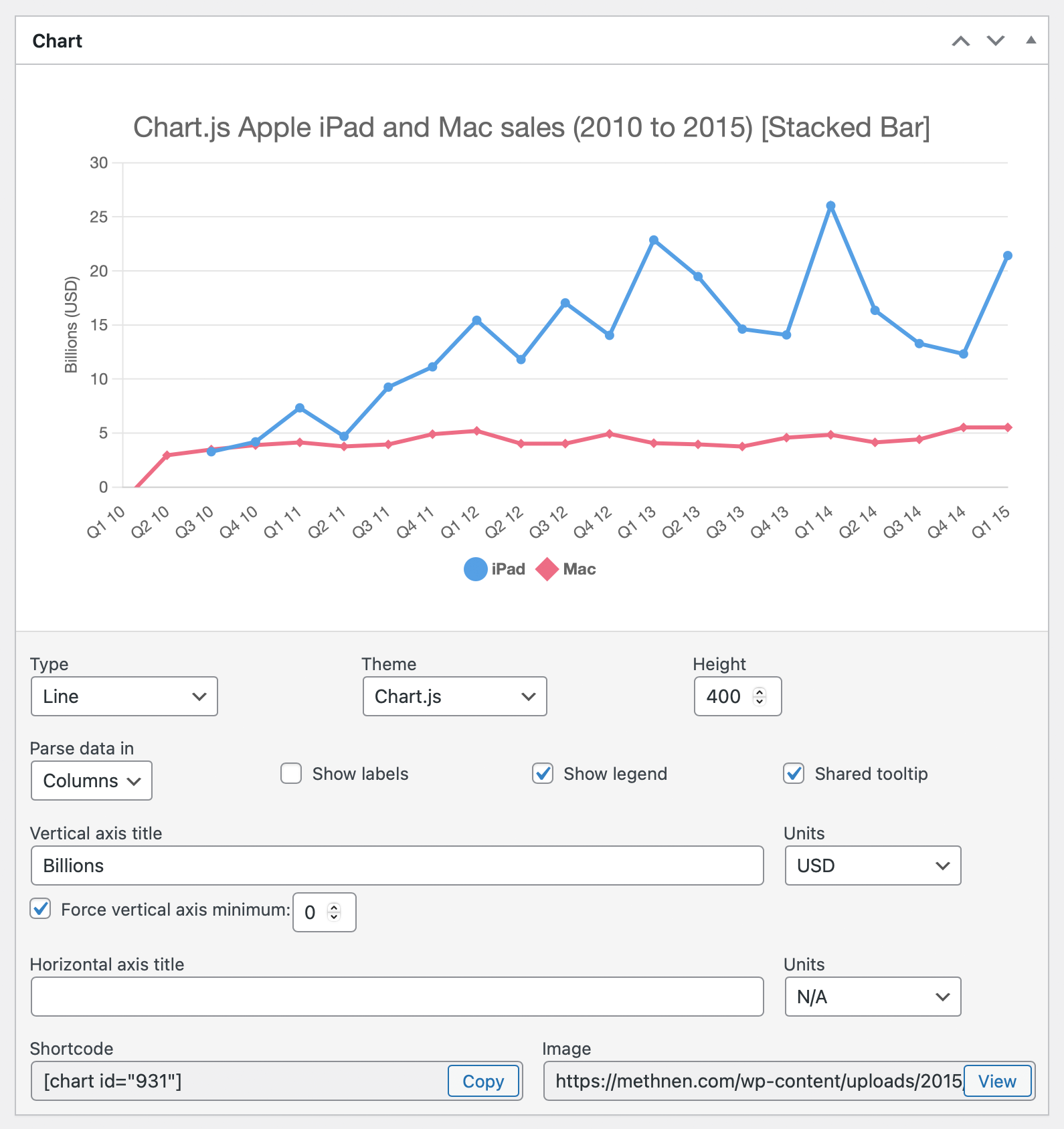
You'll find settings for:
- Chart Type — Select from all supported chart types
- Parse data in — Whether to parse data by rows or columns (default: rows)
- Color per data point — When enabled, each data point in a single series gets its own theme color instead of all points sharing the series color. This control only shows when appropriate.
- Show labels — Show value labels directly on the chart. Behavior is type-specific: paints data labels on pie/doughnut/polar slices, controls leaf labels on treemap charts, and is hidden entirely on chart types where it has no effect.
- Legend — Show or hide the chart legend
- Shared Tooltip — Show all series values in a single tooltip (line/area/spline/radar only)
- X Axis Title / Y Axis Title — Optional axis labels
- X Axis Units / Y Axis Units — Optional unit labels appended to axis titles (also populates a taxonomy)
- Force vertical axis minimum — Locks the y-axis minimum to 0
- Constrain vertical axis — Clamps the y-axis range so it doesn't auto-rescale when underlying values change. Only shows for boxplot and violin charts.
- Source / Source URL — Optional attribution text and link for the data shown in the chart
- Include source in chart — When enabled (and Source is non-empty), the source line is painted bottom-left of the chart canvas. If Source URL is also set, the source text becomes clickable.
Embedding
Each chart has an auto-generated shortcode shown at the bottom of the Chart Settings that can be copied and pasted into your posts. See Shortcode for embedding options. You can alternately use the M Chart block in the WordPress block editor.
Warning
If a chart is not published it will not render in your site and will not show in the Block UI.