
Theme Builder
The Theme Builder is a visual editor for building reusable Chart.js themes. Each theme is its own WordPress post — you assemble it from a list of styling "elements" (colors, fonts, legend, tooltip, per-chart-type tweaks, and so on), publish it, and it shows up in the chart editor's Theme dropdown for any Chart.js chart on your site. Instead of editing theme files on disk, you build and preview the whole thing in the admin.
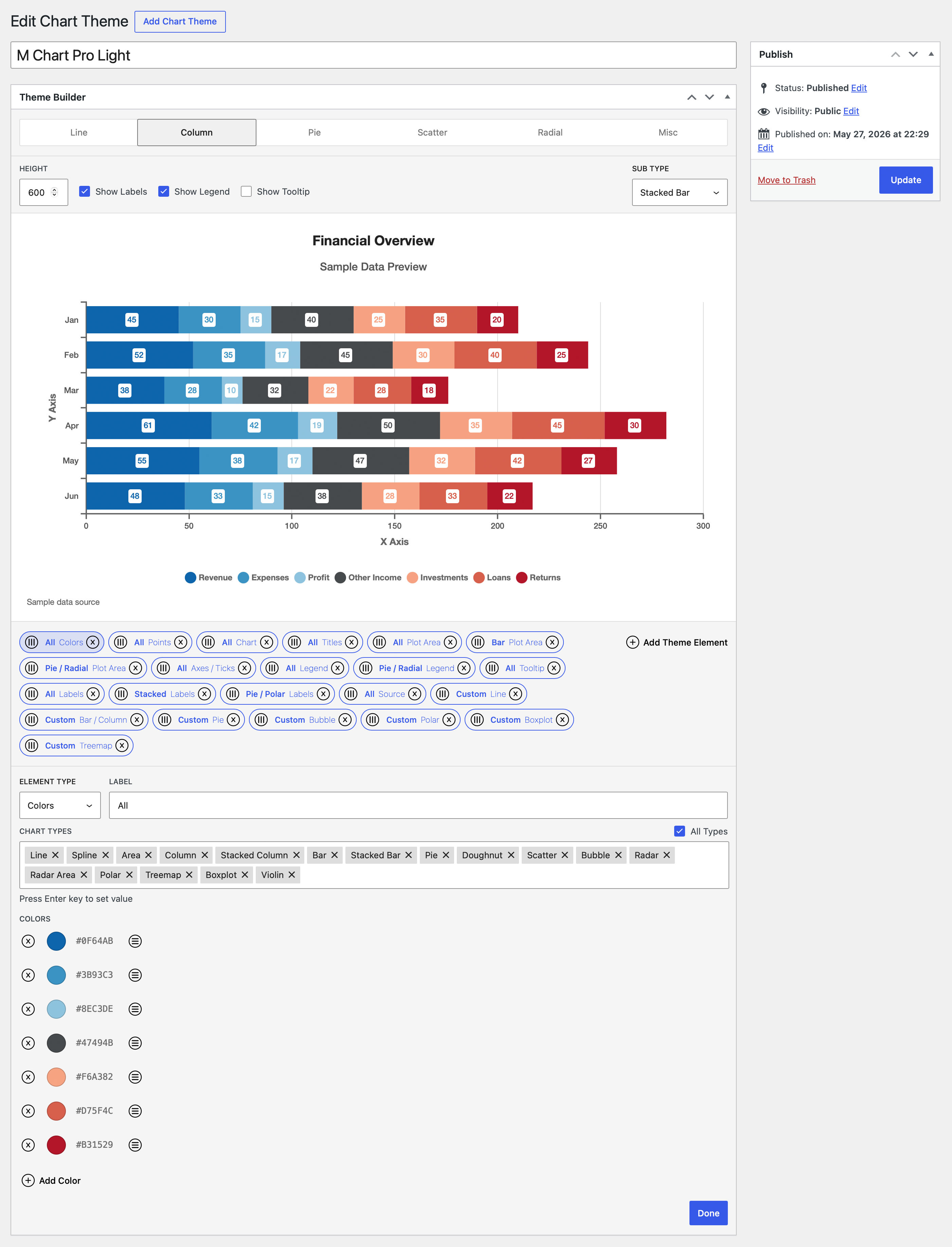
Chart.js only
Themes built here only apply to charts whose library is set to Chart.js. Highcharts charts and charts using any other library ignore them entirely. If a theme isn't taking effect, check the chart's library on the Libraries page.
Creating a theme
Go to Chart Themes → Add Theme. Chart Themes is a submenu under the Charts admin menu, marked with a "Pro" badge.
- Give the theme a name in the post Title field — this is the name that shows in the
Themedropdown later. - In the Theme Builder meta box, add one or more elements (see below).
- Click Publish.
A theme only appears in the chart editor's Theme dropdown once it is published. Drafts are not selectable.
How themes are built (elements)
A theme is an ordered list of up to 50 elements. Each element targets one part of the chart — the color palette, the legend, the tooltip, a specific chart type's lines, and so on — and is scoped to the chart types it should apply to.
Click Add Theme Element to append a new element. New elements default to the Colors type, scoped to all chart types. Each element shows as a pill in the list. You can:
- Click a pill to open its editor
- Drag a pill to reorder it (or use move up / move down)
- Delete a pill (you'll be asked to confirm)
Order matters (last wins)
All elements whose scope matches the chart being rendered are applied top to bottom, in list order. There is no per-type conflict resolution — if two elements set the same property, the one lower in the list wins. Drag elements to reorder them when you need to control which value takes precedence.
The Element Editor
Opening an element shows:
Element Type— the dropdown that picks what this element styles. Changing it fully replaces the element with a fresh one of the new type and resets its scope to all types, so set this first.Label— a required, editor-only name for the element so you can find it in the list. TheDonebutton stays disabled until the label has a value.Chart Type Picker— the scoping controls (see below).- The type-specific controls for whatever
Element Typeyou chose.
Done closes the editor. Nothing saves to the database until you Publish or Update the post.
Chart type scoping
Each element decides which chart types it applies to:
All Types— a checkbox. When on, the element applies to every chart type it's capable of styling.Chart Types— a multi-select token field shown whenAll Typesis off. It only offers the types this element type can actually affect.
Many element types are inherently limited to a small set of chart types, and the picker reflects that:
- Universal elements (
Colors,Chart,Titles,Plot Area,Legend,Tooltip,Labels,Image,Text,Source) apply to every chart type. - Some types are limited to one chart type and show it read-only —
Polar→ polar,Treemap→ treemap,Bubble→ bubble. - Others cover a small family —
Pie→ pie / doughnut;Bar / Column→ the four bar/column types;Line→ line, spline, area, radar, radar area;Points→ those plus scatter;Boxplot→ boxplot / violin;Venn / Euler→ venn / euler;Axes / Ticks→ every scaled type (everything except pie, doughnut, treemap, venn, and euler).
Element types
The Element Type dropdown lists 19 types in a fixed order — the universal/cross-cutting ones first, then the chart-type-specific ones:
| Element type | What it controls |
|---|---|
Colors | The dataset color palette |
Points | Point markers on line/area/scatter/radar series |
Chart | Chart-wide padding, background, and the chart's font |
Titles | Title and subtitle font styling |
Plot Area | Plot-area background, border, spacing, and gridlines |
Axes / Ticks | Axis lines, axis titles, tick marks, and tick labels |
Legend | Legend position, alignment, spacing, and font |
Tooltip | Tooltip background, border, layout, swatches, and font |
Labels | On-chart data labels (chartjs-plugin-datalabels) |
Image | An image painted in front of or behind the chart |
Text | A free text block painted in front of or behind the chart |
Source | Restyles the chart's built-in source attribution |
Line | Line/area/radar line styling |
Bar / Column | Bar and column borders, radius, and widths |
Pie | Pie / doughnut borders, spacing, and offsets |
Bubble | Bubble point styling |
Polar | Polar area styling |
Treemap | Treemap rectangle and label styling |
Boxplot | Boxplot / violin box, outlier, mean, and sample-point styling |
Venn / Euler | Venn / euler region borders, fills, and set/value label styling |
Where the font lives
There's no separate "Font" element. The chart-wide font — family, size, weight, style, and color — is configured on the Chart element, and it's written everywhere. Most other elements inherit from it, with an optional override.
Several element types reuse a shared Override Font block, gated by an Override … checkbox. When the override is off, the element inherits the chart-wide font set by the Chart element. When on, you can set Line Height, Font Weight (normal / bold / 100–900), Font Style (normal / italic), Font Size, Font Color, and on some elements Text Align.
Colors
Replaces the dataset color palette with an ordered, drag-reorderable list of color swatches (each a full color picker with alpha). Add, remove, and reorder colors freely. The default palette is six colors: #ed6d85, #f7d06b, #f2a354, #56a0e5, #6cbebf, #47494b. Colors are assigned to datasets in order and cycle if there are more datasets than colors.
Points
Styles the point markers on line, spline, area, scatter, radar, and radar-area charts. (Bubble points are styled by the Bubble element instead.) You add one or more point-style cards, which cycle across datasets the way colors do. Each card sets: Shape (circle, cross, crossRot, dash, line, rect, rectRounded, rectRot, star, triangle), Radius, Rotation, border mode (solid / translucent / custom) with color / width / opacity, background mode with color / opacity, matching hover border and hover background, Hover Radius, and Hit Radius. The solid and translucent modes resolve against the dataset's cycled color.
Chart
The chart-wide layout, background, and font element. This is the single home for the chart's font.
Padding Top/Bottom/Right/Left— per-side padding in pixelsBackground Color— default#ffffffFont— the font source: system, helvetica (default), futura, georgia, google, adobe, or custom. The built-in stacks need no loading; google / adobe / custom reveal extra fields (see Fonts)Font Weight,Font Style,Font Size,Font Color(default#666666)
Titles
Two font sub-blocks, one for the chart Title and one for the Subtitle. Each is an Override Font block (with Text Align) gated by its own override checkbox — both Override Title Font and Override Subtitle Font default to on. Defaults: title color #222222 at size 21, subtitle #222222 at size 18, both center-aligned.
Plot Area
Styles the plotting region's background, border, spacing, and gridlines.
Background Color— off by defaultBorder Color/Border Width— the border only draws when both are setChart Area Margin— a toggle plus four pixel values; cartesian charts onlyRadial Padding— a toggle plus four values; round chart types plus venn / euler- Gridlines —
Show X / Y / Radial Gridlinestoggles,Grid Color(default#e0e0e0),Grid Width, andStyle(solid / dashed / dotted). The radial (R) axis fields only appear when the element is scoped to a radial type.
Axes / Ticks
Applies to every scaled chart type (everything except pie, doughnut, treemap, venn, and euler).
- Per cartesian axis (X and Y):
Axis Line(color / width),Axis Title(Override Font),Tick Marks(length / width / color), andTick Labels(label padding + Override Font). - Radial axis (R):
Angle Lines(color / width),Tick Labels(padding + Override Font),Point Labels(Override Font, no Text Align), andOverride Radial Grid(a toggle that reveals Grid Shape — polygon / circular — plus a tick-label backdrop color, border radius, and padding).
Legend
Position— top / bottom / left / right (default bottom)Align— start / center / endPaddingPoint Style— a dropdown; leave empty to inherit each dataset's marker shapeLegend Margin— a toggle plus four pixel values. Chart.js has no native legend margin, so this is drawn by M Chart Pro's helper pluginOverride Font Styles— Override Font block, no Text Align
Tooltip
Background Color— defaultrgba(0,0,0,0.8)Border Color/Border WidthPadding,Corner Radius,Caret Size,Caret Padding,Title Bottom Margin,Body Line Spacing,Swatch PaddingDisplay Color Swatches— default onUse Point Shapes— default onOverride Font Styles— Override Font block with Text Align; default text color#ffffff
Labels
Styles on-chart data labels (the chartjs-plugin-datalabels plugin).
Anchor— center / start / end (default end)Align— center / start / end / top / bottom / left / right (default end)Offset,Rotation,OpacityLabel Box— a toggle that reveals background / border color / width / radius / paddingText Outline— a toggle that reveals stroke color / widthOverride Font Styles— Override Font block with Text Align; default weight 700
Image
Paints an image in front of or behind the chart (drawn by the helper plugin).
- A WordPress Media Library picker (SVG is only offered if your site allows SVG uploads)
Order— front or backOpacity— default 30Size Units— percent or pixelsWidth/Height— with an aspect-lock togglePosition— a 3×3 keyword grid plus per-axis offsets and units
Text
Paints a free text block in front of or behind the chart (drawn by the helper plugin).
Text— a multi-line textarea, max 2000 characters, HTML stripped; an empty text block is skipped at renderOrder— front or backOpacityPosition— 3×3 gridOverride Font— with Text Align
Source
Restyles the per-chart source attribution that core M Chart renders. This element only controls styling — the source text and URL come from the chart's own post meta, not from the theme.
Position— a 3×3 grid (default bottom-left with 12px offsets)Override Font— with no Line Height and no Text Align (it's a single line)
Per-chart-type elements
These elements only apply to the chart type(s) they're scoped to.
Line(line / spline / area / radar / radar-area) — Line Width, Line Style (solid / dashed / dotted), Corner Style (miter / round / bevel), Cap Style (butt / round / square; cartesian line only), Curve Smoothing (spline only: default / monotone), Tension (spline only), and Fill Opacity (affects area and radar-area).Bar / Column(the four bar/column types) — border mode with color / width / opacity, a matching hover border, Border Radius, Bar Width (barPercentage), Category Width (categoryPercentage), and Fill Opacity.Pie(pie / doughnut) — border mode (default custom#ffffff, width 2), hover border, Border Align (center / inner), Border Join Style (round / bevel / miter), Border Radius, Spacing (gaps drawn by the helper plugin), Offset, Hover Offset, and Fill Opacity. Polar area is not styled here — use thePolarelement.Polar(polar) — the same fields asPie; the differences are internal (spacing uses native arc spacing, and border radius only rounds the outer corners).Bubble(bubble) — points are forced to circles and sized from the data (per-point radius). Controls: border mode with color / width / opacity, hover border, Hover Radius (an additive bump), and Fill Opacity (default 50; the fill defaults to translucent).Treemap(treemap) — Rectangle Spacing, Rectangle Border Color (#ffffff), Rectangle Border Width, Override Label Font (with Text Align), and Override Caption Font (captions only render for hierarchical, 3+ column data).Boxplot(boxplot / violin — one element themes both) — Box Border Width, Override Outlier Style (color / radius / border width), Override Mean Point Style (color / radius), and Override Sample Points Style (color / radius).Venn / Euler(venn / euler — one element themes both) —Region Border Color(default#ffffff),Region Border Width(default 2), andFill Opacity(default 100), plus two matching label groups: for the set names,Override Set Name Font(no Text Align),Set Name Outline(stroke color, default#ffffff, and stroke width 0–10), andSet Name Box(background color, border color / width, border radius default 4, padding default 4); and the same trio for the in-region values —Override Value Label Font,Value Label Outline, andValue Label Box. Region fills follow the theme's color palette (theColorselement) automatically. Venn and euler charts have no legend, and they're inset by thePlot Areaelement'sRadial Paddingrather thanChart Area Margin. This element (and the venn / euler preview types) only appears when the core M Chart plugin provides those chart types — M Chart 2.3 or later.
Boxplot mean and sample points
The Override Mean Point Style and Override Sample Points Style controls only take effect if the chart itself has those features turned on (the chart's mean_point and sample_points meta). If a boxplot doesn't show mean or sample points, styling them in the theme has no visible effect.
Fonts
The chart's font is chosen on the Chart element's Font field. Five sources are available:
- Built-in stacks — System, Helvetica (default), Futura, Georgia. No loading required.
- Google Fonts (
Font= google) — pick a Google Font family plus weights (default[400]) and choose whether to auto-load it on the front end (default on). Requires a Google Fonts API key on the M Chart settings page; a notice appears if one isn't configured. See Google Fonts API Key. - Adobe Fonts (
Font= adobe) — enter your Adobe Fonts project ID and pick a family (fetched over AJAX), with auto-load. Available weights are display-only since they all ship via the Typekit project URL. See Adobe Fonts API Key. - Custom @font-face (
Font= custom) — supply a CSS font-family stack plus an@font-faceCSS block, with auto-load.
When auto-load is on, the chosen font is loaded automatically on the front end so the chart renders with it.
Custom font source URLs are restricted
For security, custom @font-face rules are parsed and rebuilt: only @font-face blocks survive, only the descriptors font-family, font-weight, font-style, font-display, unicode-range, and src are kept, the CSS is capped at 8000 characters, and HTML is stripped. src URLs are restricted to HTTPS same-origin or an allow-listed set of hosts; local() sources and non-HTTPS URLs are dropped. To allow an additional host, use the m_chart_pro_font_face_src_hosts filter (see For developers).
Live preview
The Theme Builder includes a live preview pane that renders a real Chart.js canvas right in the editor, running the same transforms your theme applies on the front end — so what you see matches what visitors get. A Chart Type / Sub Type switcher plus toggles for height, labels, legend, and tooltip let you check how the theme looks across different chart types and configurations as you edit. The Sub Type switcher includes Venn and Euler (a shared group, like Boxplot / Violin) with an "Audience Overlap" sample dataset.
An Include source in chart checkbox (off by default, below Show Tooltip) previews the chart's source attribution line and the extra bottom padding it adds — useful when styling the Source element.
Applying a theme to a chart
Once published, a Theme Builder theme appears in the chart editor's Theme dropdown (and in the Default Theme select on the M Chart settings page). Pick it there and the choice is stored on the chart.
M Chart has two kinds of themes:
- Built-in / PHP-file themes — the themes that ship with M Chart or are added via theme files on disk. These are covered on the Themes page.
- Theme Builder themes — the ones you create visually here, stored as posts. They show up in the same dropdown alongside the built-in themes.
For developers
Theme Builder themes are stored as a custom post type (m-chart-pro-theme) and applied to Chart.js charts via the m_chart_chart_args filter. A few extension points are available:
m_chart_pro_font_face_src_hosts— filters the allow-list of hosts permitted in custom@font-facesrc:URLs. See the PHP Hooks & Filters reference for the full entry.M_Chart_Pro_Themes::parse_theme_slug( $slug )— converts a theme slug back to its post ID (orfalse).M_Chart_Pro_Themes::build_theme_slug( $post_id )— builds them-chart-pro-theme-{post_id}slug for a theme post.get_elements( $post_id )— returns a theme's array of element objects (or[]); a relatedget_elements_for_chart_type( $post_id, $chart_type )narrows that to the elements that apply to a given chart type.
See PHP Hooks & Filters for the complete filter reference.