
Smart Data Selection
Smart Data Selection lets a chart ignore stray cells, rows, and columns in its spreadsheet — automatically, or picked by hand — without ever changing the stored data. It lives in the Spreadsheet meta box, directly below the External Data panel, and appears on every Chart.js chart whether or not External Data is in use.
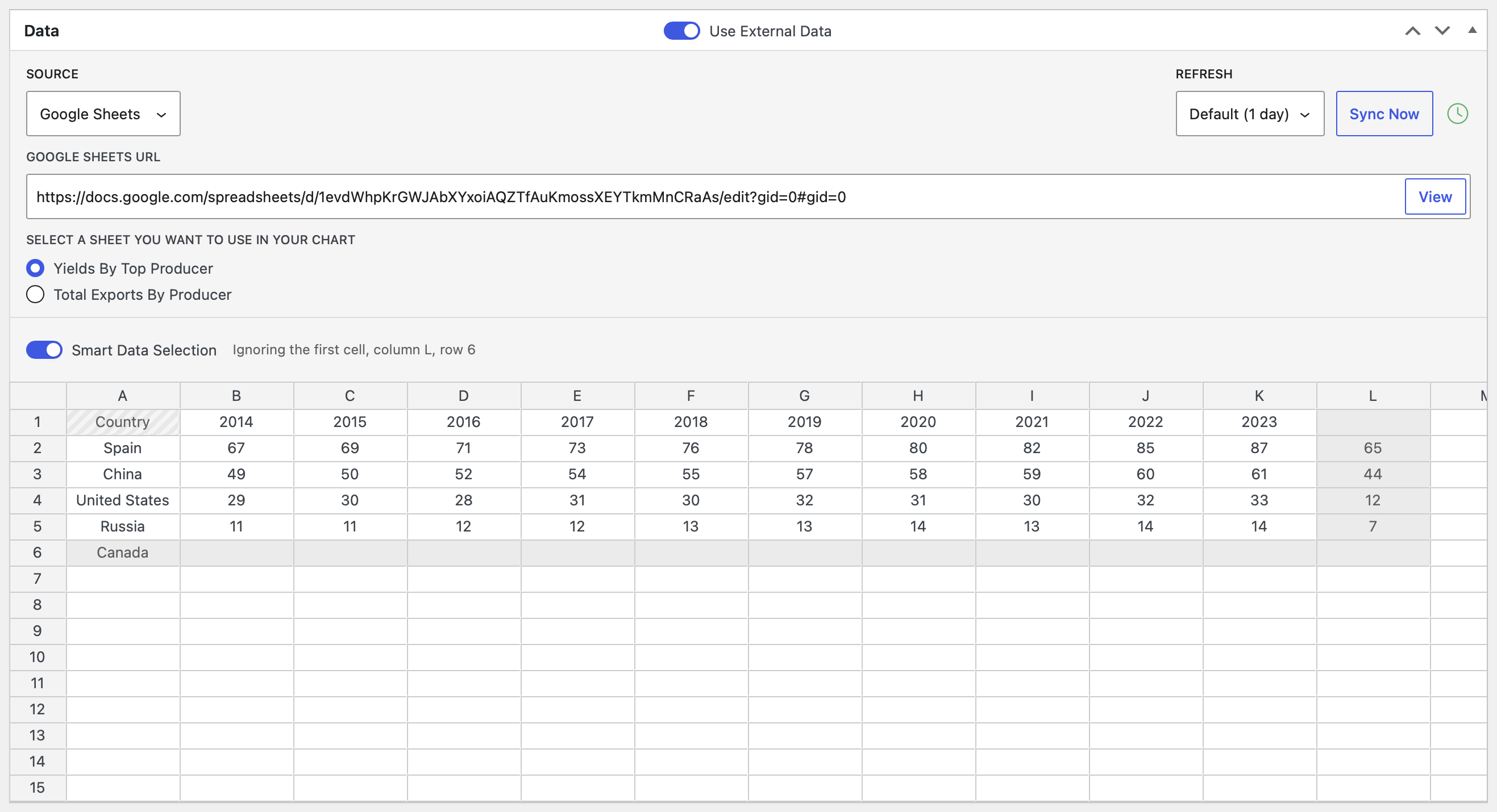
Chart.js only
The Smart Data Selection panel only appears on charts whose library is set to Chart.js. On Highcharts charts the panel is hidden. If you don't see it, switch the chart's library on the Libraries page. It also requires M Chart 2.2.2 or later alongside M Chart Pro 1.1.
What it solves
M Chart reads the shape of your spreadsheet to decide what's a label and what's data. A little bit of clutter can throw that reading off and break the chart:
- A stray header word in the first cell, where a multi-series chart expects an empty corner
- An unlabeled column of values
- A labeled row or column with no data behind it
- Empty rows or columns in the middle of the data
Smart Data Selection keeps that clutter out of the chart while leaving it in the spreadsheet.
Non-destructive
Smart Data Selection never edits the stored spreadsheet. Exclusions are applied as a mask when the chart is rendered — on the front end, in embeds, and in background-synced renders. In the editor you always see the full grid: excluded cells are shaded grey so it's clear what the chart is using, and a first cell that's being treated as empty gets a diagonal-stripe treatment (present, but ignored). Turn everything back on and the original data is right where you left it.
You can see both treatments in the screenshot above: the Country header in the first cell is striped, and the partial column L and empty row 6 are shaded.
Auto mode
The Smart Data Selection toggle is on by default, which means Auto mode. M Chart analyzes the structure of the grid — never the meaning of the words in it — figures out which rows and columns are valid chart data, and ignores the rest. It re-analyzes every time the data changes, so the selection grows and shrinks with your data.
A summary line next to the toggle reports what's being left out, for example Ignoring the first cell, column L, row 6 — or All data included when nothing needs excluding.
Venn and euler charts are the one exception: their data points are text — membership lists, not numbers — so the structural analysis Auto mode relies on would misfire. On those charts Auto mode passes the grid through untouched and the summary simply reads All data included. Manual mode works normally if you need to drop rows or columns.
Manual mode
Turn the Smart Data Selection toggle off to pick the data yourself. Checkboxes appear directly on the spreadsheet's column letters and row numbers, and a controls row appears above the grid with a Mode select and an Automatically include new rows and columns checkbox. A corner checkbox on the top-left cell of the grid treats the first cell as empty, so the first row and first column are both read as labels even when something is typed there.
Trailing empty rows and columns past your data are just editor padding — they're ignored automatically and don't get checkboxes.
An info badge above the grid always spells out what the current combination of settings does, for example: "Checked rows and columns are used in the chart, new rows and columns stay out, and the corner checkbox treats the first cell as empty."
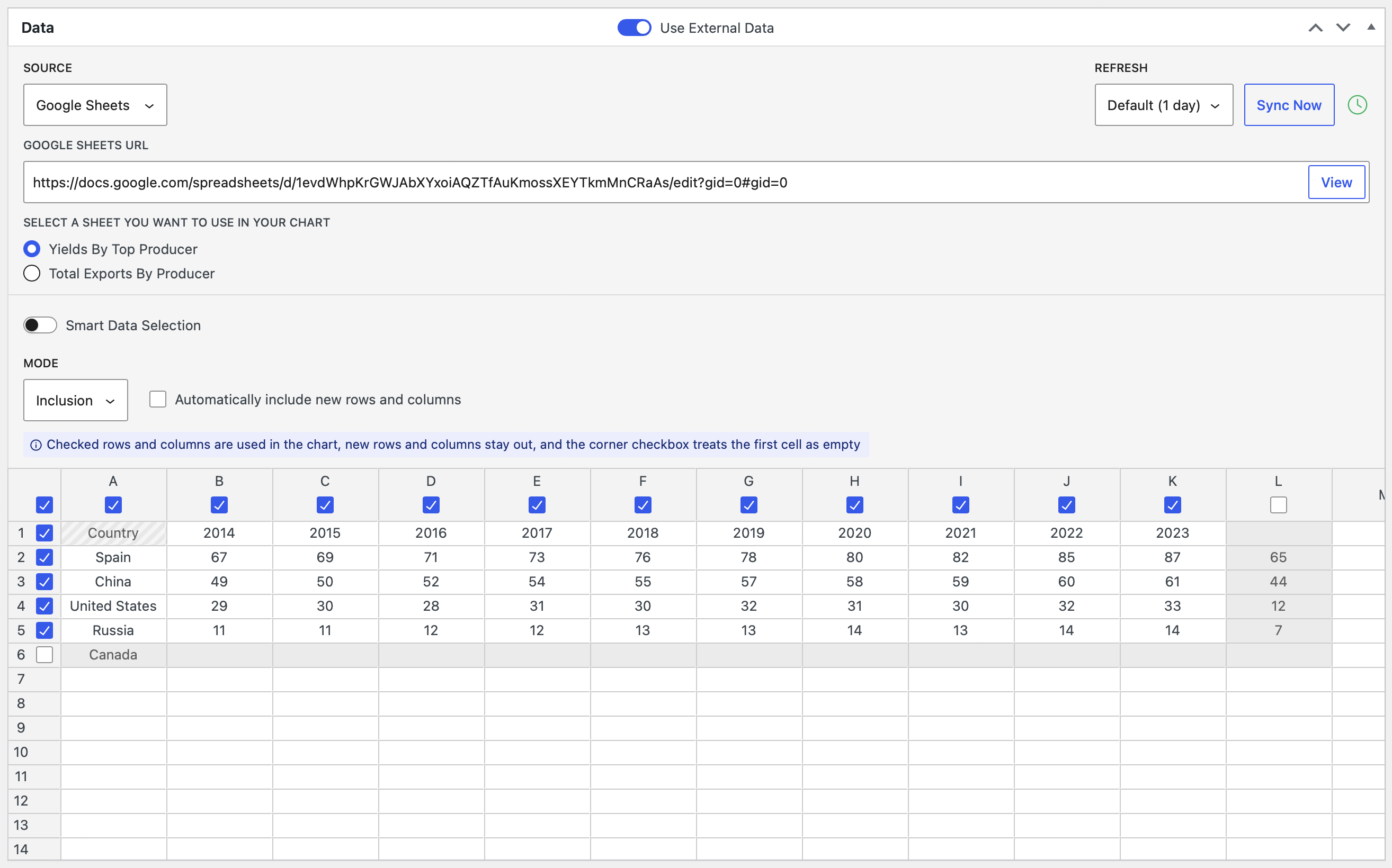
Inclusion and Exclusion
The Mode select controls what a checked box means:
- Inclusion (the default) — checked rows and columns are used in the chart; everything else is left out. A whitelist.
- Exclusion — checked rows and columns are ignored; everything else is used. A blacklist. The checkbox tooltips flip to match (
Ignore column L).
Switching modes converts your selections behind the scenes, so the effective result is preserved — flipping the Mode select never changes what the chart shows on its own.
New rows and columns
The Automatically include new rows and columns checkbox decides what happens when data is added beyond the shape you made your selections against — whether typed in by hand or brought in by an External Data sync. Combined with the mode, that gives four behaviors:
| Mode | Automatically include new | What the chart uses |
|---|---|---|
| Inclusion | Off (default) | Exactly the rows and columns you checked. New data stays out. |
| Inclusion | On | Everything you checked, plus any rows and columns added since. |
| Exclusion | On | Everything except what you checked. New data flows in automatically. |
| Exclusion | Off | Everything in the shape you saved, minus what you checked. New data stays out. |
Warning
When the data's shape changes after you made your selections, the panel shows a warning — "The data shape has changed since these selections were made, review them below." — so you can check what's now in or out. The one silent case is pure growth while Automatically include new rows and columns is on: new rows and columns just flow in as promised. Shrinks and reshapes always warn.
With External Data
Smart Data Selection works with manually entered data and with External Data — both Remote CSV and Google Sheets — including scheduled background syncs. Synced renders apply the mask too, with no browser involved.
Since a synced spreadsheet can't be edited by hand, Smart Data Selection is also the way to drop junk rows or columns that the source includes. If the source grows over time, either Auto mode or manual Exclusion mode with Automatically include new rows and columns works well — you drop the junk lines once, and new data flows into the chart on every sync.
Multi-sheet charts
On multi-sheet chart types, manual selections are remembered per sheet — switching tabs shows that sheet's own selections, and Auto mode's summary line always describes the sheet you're looking at.
Limits and gotchas
- Chart.js only — the panel is hidden on Highcharts charts.
- Requires M Chart core 2.2.2 or later.
- In manual mode with
Automatically include new rows and columnsoff, new rows and columns stay out of the chart until you review the selections — the panel warns when the data shape changes. - Switching between Inclusion and Exclusion preserves the current effective selection; it never changes what the chart shows on its own.
- The mask applies everywhere the chart renders (front end, embeds, background syncs); the editor always shows the raw, unmasked grid with excluded cells shaded.
- On venn and euler charts, Auto mode never excludes anything — use Manual mode there.
- Nothing is ever deleted — toggling modes or changing selections never edits the stored spreadsheet.